 THIS VIDEO EXPLAINS THE EXPECTATIONS FOR THE DAY!
Our 1st semester will focus on media creation, while or 2nd semester will focus more on coding.
Regardless of the lesson, FouloisTech.info should be your destination every time you come into class. This space will be used to provide announcements, lessons, and other resources.
- Objective:
- Students will create movie posters to segue from video production to graphic design.
- Announcements:
- The deadline for late work was Thursday, October 17th!
- While most/all of you are caught up on your work, every assignment for the rest of Q1 is due on the day it's assigned and CANNOT be handed in late without an excused absence!
- This deadline is 2 weeks before the end of the Quarter. That time is needed to ensure all late work handed in before then is graded in a timely fashion.
- Previous lessons: Audio 1, Audio 2, Audio 3, Audio 4, Audio 5, Video 1, Video 2, Video 3, Typing 1, Video 4, Video 5, Video 6
- The deadline for late work was Thursday, October 17th!
- Today's Lesson
- Graphic Design 1: Movie Poster
- Grading Rubric:
4 Points Image Text has very few spelling and/or grammatical errors. Proofread! 3 Points Picture included relates to the text. 3 Points Little to no unused (negative) space exists in the image. - Today, Mr. Smith is going to show you some basics about making a movie poster. These include:
- Text should always be as readable as possible!
- The value (how light or dark something is) of the text should be very different from its background.
- Larger text is usually better.
- TYPE IN ALL CAPITAL LETTERS! (You will almost never be told to do this, but for this project it's a good idea.)
- Empty space is often wasted space.
- You can add more stuff to fill the space, but sometimes, it's better to take something that's already there and make it larger.
- Text should always be as readable as possible!
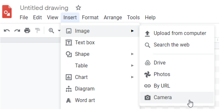
- There are many tools we can use to make a movie poster, but today we're going to start off simple with Google Drawings.
- https://drawings.google.com/
- (If you need to find your drawing again, you can look for it in your Google Drive.)
- You will need a screenshot of a dramatic moment in your movie.
- Here's how to take a screenshot on your ChromeBook.
- Don't have a dramatic moment to screenshot? Pose for one now!

- Once you've added your picture, make sure it fills as much space as possible.
- It's OK to have it go over the edge! Just make sure you don't crop off anything important.
- With your picture in place, add your text!
- What's the movie name?
- Who's the star of the movie?
- Is it easy to read the text where it is?
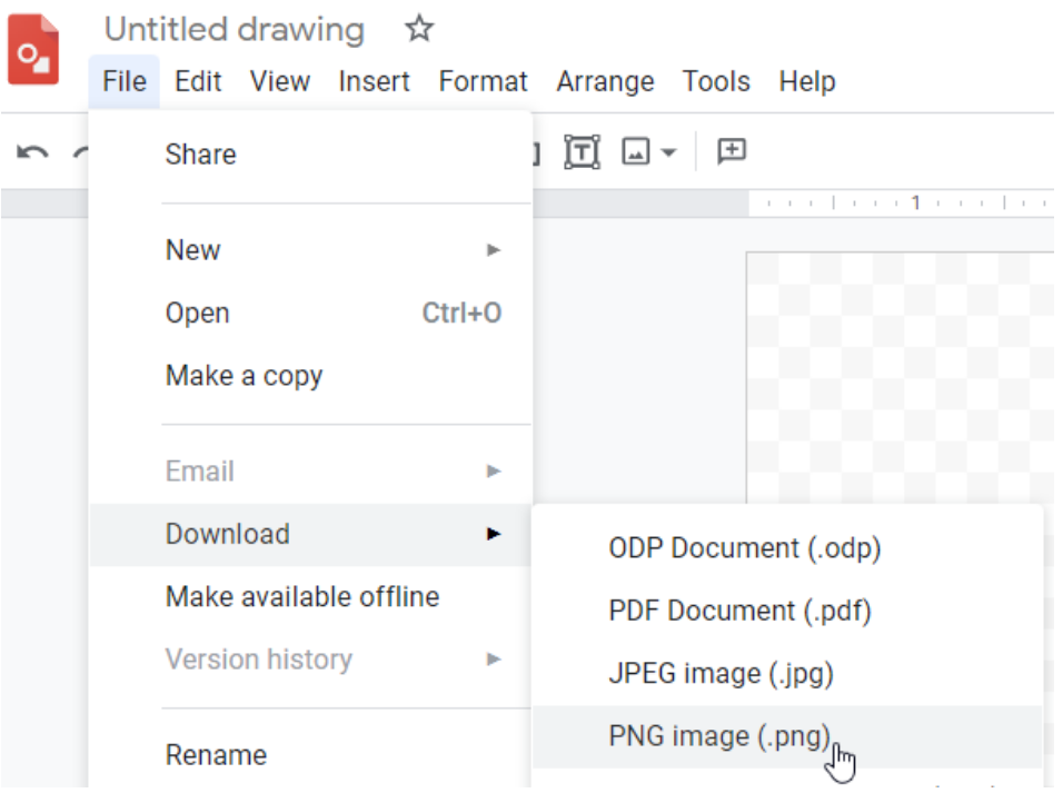
- With your image and text in place, download your poster as a png file!

- Now that you have a poster downloaded, use Canvas to hand it in!
- Today, Mr. Smith is going to show you some basics about making a movie poster. These include:
- Grading Rubric:
- Graphic Design 1: Movie Poster
- You will only have two attempts to hand this in. If your first attempt does not earn a 10/10 you will receive feedback on how to improve it.
- This is an IN-CLASS assignment, NOT HOMEWORK. Please stay on task to complete this work by the end of class!
