Today's Agenda:
THIS VIDEO EXPLAINS TODAY'S EXPECTATIONS!
- Announcements
- NO late work is being accepted after October 19th. (2 weeks before the end of the Quarter.) To allow late work later than that would not give me time to grade it.
- Today's Lesson: Graphic Design 2: Personal Logo
-
- Grading Rubric:
4 Points Image should include one or more student initials. 3 Points Image should include a graphic element. (Don't have it JUST be a word or letter(s)! 3 Points Image should NOT be more than two colors! (In this rare case, black and white count as colors.) - Today, Mr. Smith is going to show you how to make a personal logo! We'll begin by remembering some important things from our last class.
- Text should always be as readable as possible!
- The value (how light or dark something is) of the text should be very different from its background.
- Larger text is usually better.
- TYPE IN ALL CAPITAL LETTERS! (You will almost never be told to do this, but for this project it's a good idea.)
- Text should always be as readable as possible!
- There are many tools we can use, but today we will be using Method Draw!
- Begin by using the Text tool to add a single letter from your name into the Method Draw canvas.
- Stretch it out! Change the font! Change the color! What else can you do?
- Consider adding a 2nd letter from your name. This may or may not work well, but try to get them to overlap in a way that looks cool.
- Overlapping the letters might work better if they're the same color, or they may need to be two different colors depending on the effect you want.
- Use the shape tools and find something that represents you in some way.
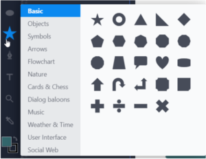
- Clicking on the star will give you access to many more than the usual basic shapes.

- You can also combine shapes to make a new shape if they're the same color.
- You can right-click or two-finger-click on anything you've added to move it in front of or behind your other shapes and letters.
- Clicking on the star will give you access to many more than the usual basic shapes.
- Look over your logo. It should only have two colors.
- If you have more than two colors, decide on two colors you really like that have a high contrast (the value of each color is very different) and change the other colors to be one or the other.
- Click on the shape whose color you want to change.
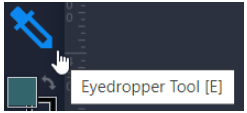
- Click the eyedropper tool.

- Click the color you want the selected shape to be.
- If you have more than two colors, decide on two colors you really like that have a high contrast (the value of each color is very different) and change the other colors to be one or the other.
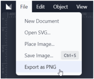
- To download your finished logo, click on "File," then click "Export as PNG."

- Today, Mr. Smith is going to show you how to make a personal logo! We'll begin by remembering some important things from our last class.
- Now that you have a logo downloaded, use the text box in Canvas to share your poster with the rest of the class!
- Remember the button for adding images looks like this:

- Remember the button for adding images looks like this:
- Grading Rubric:
-
