THIS VIDEO EXPLAINS THE EXPECTATIONS FOR TODAY!
Today's Agenda:
- Announcements
- The last day to hand in late work was October 19th! (2 weeks before the end of the Quarter.)
- Every lesson between now and the end of the Quarter MUST be handed in the same day it is assigned.
- Today's Lesson: Graphic Design 2: Personal Logo
-
- Grading Rubric:
4 Points Image should include one or more student initials. 3 Points Image should include a graphic element. (Don't have it JUST be a word or letter(s)! 3 Points Image should NOT be more than two colors! (In this rare case, black and white count as colors.) - Today, Mr. Smith is going to show you how to make a personal logo! We'll begin by remembering some important things from our last class.
- Text should always be as readable as possible!
- The value (how light or dark something is) of the text should be very different from its background.
- Larger text is usually better.
- TYPE IN ALL CAPITAL LETTERS! (You will almost never be told to do this, but for this project it's a good idea.)
- Text should always be as readable as possible!
- There are many tools we can use.
- If you are on your ChromeBook, a good option is Method Draw: https://editor.method.ac/
- If you are on one of the lab computers, Mr. Smith installed Inkscape. It's like Method Draw but with more buttons.
- Begin by using the Text tool to add a single letter from your name into the canvas.
- Stretch it out! Change the font! Change the color! What else can you do?
- Consider adding a 2nd letter from your name. This may or may not work well, but try to get them to overlap in a way that looks cool.
- Overlapping the letters might work better if they're the same color, or they may need to be two different colors depending on the effect you want.
- Use the shape tools and find something that represents you in some way.
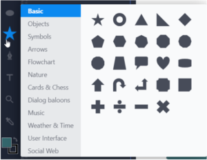
- Clicking on the star will give you access to many more than the usual basic shapes.

- You can also combine shapes to make a new shape if they're the same color.
- You can right-click or two-finger-click on anything you've added to move it in front of or behind your other shapes and letters.
- Clicking on the star will give you access to many more than the usual basic shapes.
- Look over your logo. It should only have two colors.
- If you have more than two colors, decide on two colors you really like that have a high contrast (the value of each color is very different) and change the other colors to be one or the other.
- Click on the shape whose color you want to change.
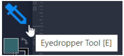
- Click the eyedropper tool.

- Click the color you want the selected shape to be.
- If you have more than two colors, decide on two colors you really like that have a high contrast (the value of each color is very different) and change the other colors to be one or the other.
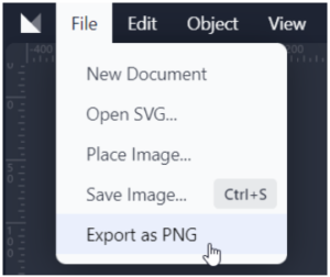
- To download your finished logo, click on "File," then click "Export as PNG."

- Now that you have a logo downloaded, use the text box in Canvas to hand it in!
- Remember, the button for adding images looks like this:

- Remember, the button for adding images looks like this:
- Remember, the last day to hand in late work was October 19th! No project handed in late will be graded.
- Today, Mr. Smith is going to show you how to make a personal logo! We'll begin by remembering some important things from our last class.
- Grading Rubric:
-
